i have a thing for dangerous, floating staircases...
photographed by alec soth
Wednesday, November 16, 2011
Sunday, October 9, 2011
ellen von unwerth
Thursday, October 6, 2011
Wednesday, October 5, 2011
Tuesday, September 27, 2011
Thursday, September 22, 2011
it's been awhile...
here is the latest, a travel piece i wrote for the summer issue of Anthology magazine, in collaboration with the talented Ms. Jen Siska...pick it up at West Elm or Anthropologie...
Thursday, June 23, 2011
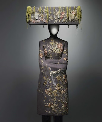
mcqueen
alexander mcqueen's savage beauty at the met was the most beautiful show i've seen in a long time. mcqueen is really the only person in fashion that has ever had such an influence on me. he draws upon historical reference and romantic imagery to create a dark fantasy world that is rich and otherworldly. everything so well tailored and incredibly detailed and feminine. a little bit twisted and a little bit rock and roll and always sexy. everything a woman wants to be.
Thursday, June 16, 2011
Monday, June 13, 2011
graypants
Two guys from Seattle making some of the most original lighting and furniture i've seen in a while...and they're cute. this video is a behind the scenes look at their process. i am in love with their scrap lights, seriously beautiful work.
What is Graypants? from Zeek Earl on Vimeo.
Sunday, June 12, 2011
Thursday, June 9, 2011
why i love the french
they hate on everything. jean touitou of APC shares his distaste for religion, nations, and details..
CH Video: Jean Touitou from Cool Hunting on Vimeo.
Monday, June 6, 2011
three bedrooms
Saturday, June 4, 2011
fantasy in the forest
Monday, May 30, 2011
An Architect's Fear
I didn't have time to see Rem Koolhaas and Shohei Shigematsu's exhibit 'Cronocaos' at the New Museum in New York, but the theme is something that resonates deeply with me. It explores the potentially damaging effect that preservation movements can have on older buildings, creating sterile environments in which their historical character is erased. They examine this by taking an old restaurant supply store and splitting it in half, leaving one half in its original state, raw and exposed, yet beautiful in its flaws, and the other half stark white and bland, modernized to conform to the standards of real estate developers and yuppies in cities across America. Genius, and a bit sad. Nicolai Ouroussoff writes about it here.
Thursday, May 12, 2011
Wednesday, March 16, 2011
Thursday, March 10, 2011
Monday, March 7, 2011
ando
Ok, so I wrote that post about my disillusionment with modern architecture and then I came across a photo of Tadao Ando's Church of the Light today and I remembered what I love about it. It almost takes more ingenuity to create something so beautiful in its simplicity. His pure representation of material, his relation to the environment, his interesting use of light is what makes architecture so awe-inspiring. And, he uses two of my favorite things: concrete and crosses!
Thursday, March 3, 2011
art in philly
Last time I went home to Philly I had the pleasure of meeting Jonathan Slingluff, owner of the Slingluff Gallery on Girard Ave. I had heard about him doing a show with Neil Krug the month before and was curious to see the space and find out what kind of art scene (if any) was going on in the city these days. Fishtown is definitely a bit of a hipster 'hood with Johnny Brenda's a few doors down so it seems like the perfect place for a gallery. But as we know, hipsters usually only come out at night. And they typically don't have money to spend on art. Despite all this, it's a lovely little space with exposed brick and lots of warm light streaming in, run by the very friendly Jonathan who has an amazing eye for up and coming artists. Their next show opens tomorrow - Jai Tanju, a street artist/photographer from San Jose. Support the art scene in Philly! Slingluff is one of the few galleries that feels relaxed and unpretentious, so definitely stop by, for the stellar art and stimulating conversation.
Jai Tanju
Jai Tanju
Sunday, February 27, 2011
old vs. new
Lately it seems that every architect is either a) throwing a cube on the ground with a few windows and calling it modern architecture or b) going the extreme opposite direction and creating these insane amorphic abstractions to be different. I came across some photos of Princeton circa 1969
and found myself getting a bit sentimental for the town I lived in for almost 2 years and longing to live somewhere with some history. There is something romantic about the architecture of the past, the buildings that took years to create, with such painstaking detail put into them. buildings that grow more beautiful with age, when a graceful patina settles over them, rather than looking outdated in a matter of years... I'm not sure if the architecture is what creates those feelings or the time period that it represents, a time when people wrote letters and there was actual human interaction! some are able to blend old and new in a thoughtful and original way (berlin), but most cities seem to be carelessly creating these bland cookie-cutter urban landscapes. regardless, I think i'd rather be here..
than here..
(middle photo via lost)
Monday, February 7, 2011
more pop-ups
What Happens Next is a new restaurant installation in NYC - rotating concepts in menu, design, music, etc. I love this idea and here is the latest interior:
I love the black walls and that they drew architectural symbols on them (a bit hard to tell from the photo)
Wednesday, February 2, 2011
Tuesday, January 25, 2011
Saturday, January 1, 2011
before / after
Subscribe to:
Posts (Atom)