Friday, November 9, 2012
Monday, November 5, 2012
van der straeten
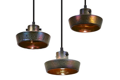
French lighting and furniture designer Herve van der Straeten's creations are my latest obsession. Designing sculptural, bronze infused pieces with an edge, his work is functional art.
Wednesday, October 24, 2012
zoe strauss
Last night I saw photographer Zoe Strauss lecture at CCA and it was pretty inspiring. now in her 40s, she has a manic sort of energy and enthusiasm about her, telling stories in a sort of rambling way, with a childlike awe for everything around her. Her humility and appreciation for the way the art community has embraced her was refreshing as well as her refusal to conform to anyone's standards of how she should portray her art.
Strauss showed images from her 10 years series that she showed under the I-95 overpass in Philadelphia from 2001-2011. they are mostly images from her hometown, the human side of a very working class, gritty and diverse environment. Having grown up in Philadelphia, it felt close to my heart to see these images and hear her stories about the neighborhoods. What impressed me the most is how well thought out and carefully conceived her projects are. She thinks deeply about the relation between her images and the location of where it should be placed, the social and political impact of her art. She is also very funny, intelligent, and irreverent.
It's rare to see an artist that is using their art to bring about some kind of positive change while also reflecting the world we live in in a beautiful, real way- not some pretty, glossy version of it. I'm sad I never got to see her show at the museum of art in Philly, but here are some of my favorite images.
Saturday, October 6, 2012
Tuesday, September 18, 2012
Thursday, August 23, 2012
conversions
Lately I've been fantasizing about the idea of converting an old church or barn in the country.
design traveller has posted some great photos of people that have done it quite well.
Monday, July 23, 2012
Friday, July 20, 2012
Friday, July 13, 2012
Tuesday, May 22, 2012
Thursday, May 17, 2012
Wednesday, May 16, 2012
2 things
The rooms at the San Francisco Decorators Showcase are usually too overdone for my taste, but at the very least they are always entertaining to look at. This year there was a lot of eye candy, and my two favorite things had to be:
this amazing moss fireplace (try to ignore the ugly chair to the left)
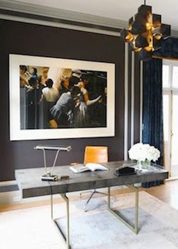
this gorgeous desk (and light fixture!)Tuesday, May 15, 2012
anne griswold tyng
Rarely do we hear about women architects, yet there are many who have done such influential, innovative work. Anne Griswold Tyng studied under Gropius and Breuer, worked at Louis Kahn's office (whom she also had an affair with) and did some amazing geometric, Bauhaus-influenced design in Philadelphia where she lived. I love this fireplace, such an interesting example of old architecture translated into modern design.
photo via New York Times
Wednesday, May 9, 2012
too good
I am a huge fan of London's Studio Toogood. They do a bit of everything, but their creative direction and styling is pretty genius. Dream job!
Monday, May 7, 2012
blue
It's hard to pull off blue walls, they either tend to look babyish or dark and depressing. The blue on this wall is amazing though, I suppose it helps to have skylights and 20 foot ceilings in your apartment. Oh, and that Richard Prince piece to the left.
photo via new york times
Thursday, May 3, 2012
Wednesday, May 2, 2012
donald judd
It's been about a year since our trip to Marfa, and so I thought it fitting to post some Donald Judd today. Here are some notes I wrote down while doing the Block tour of his studios and residence (which I highly recommend):
Judd's signature adobe brick walls are beautiful, showing signs of decay and patina over the years. His very linear-style furniture is scattered throughout the courtyard and inside the studios, and we enter into his library which houses an incredible collection of more than 12,000 books. Everything seems completely random and yet intensely thought out. The guide tells us that he organized his books according to subject matter, and within that, birthdate of author. There's clearly a method to his madness, and it's interesting to see someone with such an obsession for order and detail and precision, to be completely visionary in his works. His pieces are staggered within the large open spaces, and even the placement of the art has been carefully planned, with just the right amount of negative space around them to let the pieces breathe and be appreciated for their bold colors, unique materials and craftsmanship. We peek through windows at his residence at a central open staircase is a modernist's dream and a parent's worst nightmare. The children's rooms look cold and austere and I can only imagine the dramatic fallout if his teenage son ever dared to hang a pink floyd poster on the wall.
ha! what is it about madness and genius that usually go hand in hand?
Monday, April 30, 2012
Carlo Scarpa built La Tomba Brion in 1970-1972, an impressive work of concrete detail and layering, creating beautiful effect with light and shadow. It's a work that I think perfectly blends architecture with the natural environment, and apparently Scarpa agrees. "I consider this work, if you permit me, to be rather good and which will get better over time. I have tried to put some poetic imagination into it, though not in order to create poetic architecture but to make a certain kind of architecture that could emanate a sense of formal poetry...."
Subscribe to:
Comments (Atom)


